The Daily Plan Bar
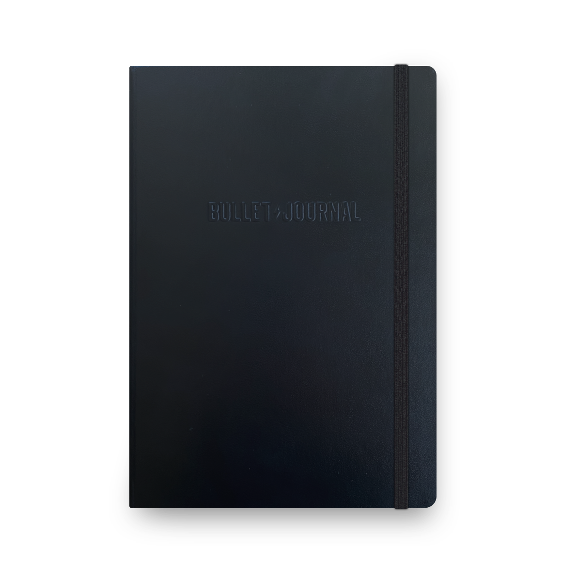
This past year I’ve started using a modified form of the Bullet Journal approach, using a dot grid notebook, thanks to a gift of an official Bullet Journal Notebook from creator, Ryder Carroll. As many do, I’ve made a few modifications to the standard approach—one was switching to square checkboxes, and the other: The Daily Plan Bar. After using and tweaking The Daily Plan Bar idea for almost a year, It seemed time to document it and share the idea in more detail.
What is the Daily Plan Bar?
The idea is simple—and credit where credit is due—it was inspired by my friend, Bill Westerman way back in 2006.Building the Daily Plan Bar
First of all, I like keeping things simple. I prefer dot grid notebooks, like a Leuchtturm1917 A5, or a Baron Fig Confidant, because the lighter grid offers a structure, yet doesn’t overpower the page like a squared page can. Still, squared pages work well too. My pens of choice lately are good old Papermate Flair felt-tipped pens in black and colors, though I use all sorts of other gel pens too. Step 1: Begin by writing the day’s the date at the top of the page.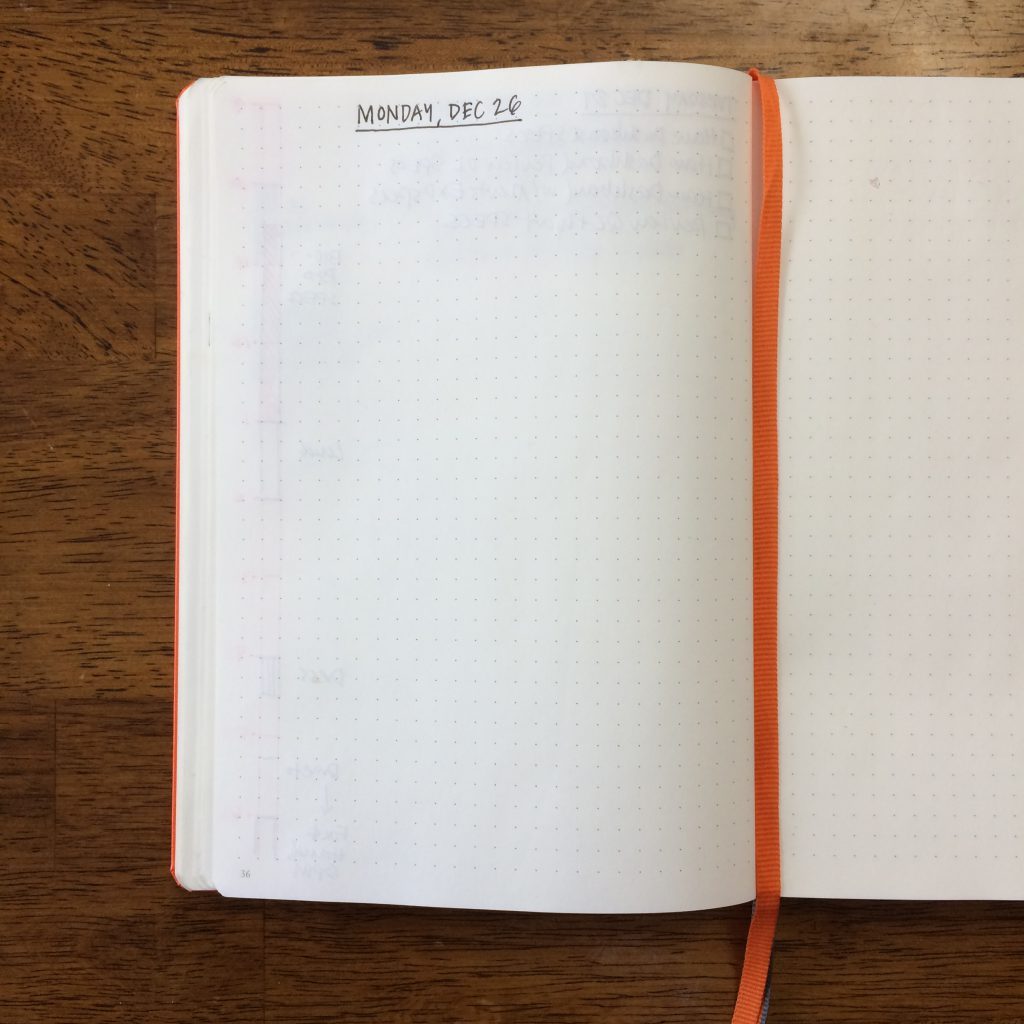 Step 2: Leave one vertical grid of space from the edge of the page, then draw two vertical parallel lines starting at the top of the grid, right to the bottom of the grid, vertically. Straight edges come in handy for this. Left page: the bar is on the left (I use a bright orange or other bright color flair marker to contrast to the black used for the details.):
 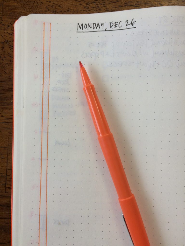 Right page: the bar is on the right:
  Create the bar on the right side of the page, for right-hand pages.
Step 3: Create hour blocks with the vertical bar by closing off the top of the two vertical lines with a horizontal mark, adding horizontal marks down the vertical bar every 4th grid measure, like this:
 Count off 4 grid, then create a horizontal line, to represent an hour of time.
  Step 4: Add hours on the left edge of the vertical bars. In addition to identifying one hour increments, the dot grid rows allow you to break each hour chunk into 15 minute increments. The margin to the left (or right) of the Plan Bar provides space for the hour indicators.
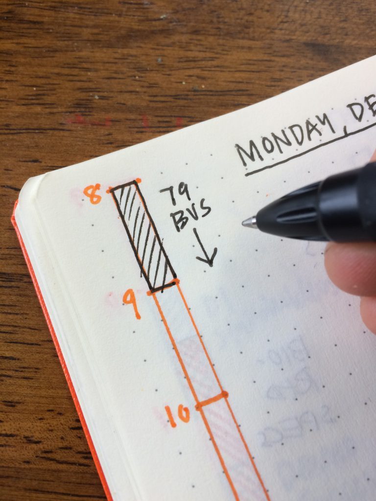
  Step 5: Map out your day, using different hatch patterns and/or colors to identify the blocks of time. Here’s a block of time marked with an angled hatch and label.
 Blocking out time for design or other creative work, instead of leaving these as open space, encourages me to protect and fight for my focused work time.
  You can just use the squares needed to represent time. Email is a 30 minute time block. For meetings I’ll include people’s names, locations, room numbers, phone numbers — whatever helps me define the time block.
  As the day unfolds, I’m not afraid to reshuffle — and if that can’t be done within the bar, I add a new section to the right or left of the bar with the updated changes. Doing this helps me see changes more clearly.
 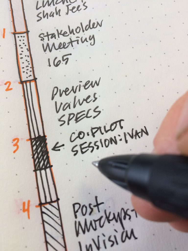 Adding a 30 minute impromptu co-piloting design meeting to my plan. If a meeting gets cancelled, I simply X it out and leave a note.This is how I cancel and annotate a cancelled meeting.
  Step 6: Below the date on the top left or right, I use traditional task list, placing the most important tasks at the top with stars next to them. If a more important task is added later on in the day, I’ll use a star to the left of that task for emphasis. Stars help me see the most important tasks for the day.
  Step 7: The remainder of the page is free for notes, drawings, sketchnotes, or whatever I might need to think through during the day. Often I will log decisions I make as they happen, so I can scan back in my book later on. A completed page, featuring the Daily Plan Bar, tasks, notes and an explanatory sketchnote of a Moka Pot.
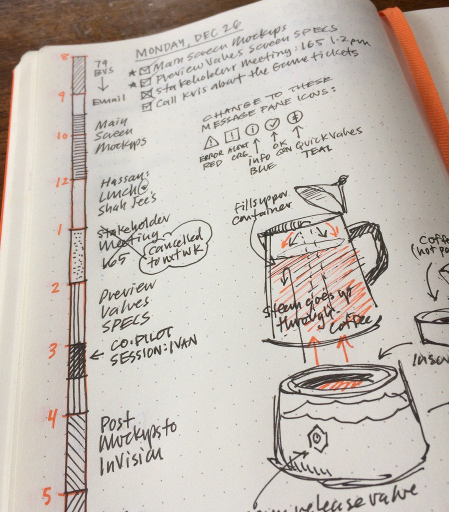 The beauty of the system is that it’s simple, and I like the morning ritual of laying my day out. I appreciate how this analog approach frees me from constantly looking at my calendar on my Mac, or on my phone. I place my notebook on my desk, so it’s easy to scan. Using an analog tool like the Daily Plan Bar and a simple task list helps me focus on my planned activities and tasks, while my email and calendar apps stay off. Additionally, I have a daily record I can scan back through to see where tasks were started and completed, where changes were made, or to find ideas or thoughts about a project. I’ve been using this system since March 2016, and have found it a worthwhile practice. I hope it inspires and helps you too.
The Daily Plan Bar
This past year I’ve started using a modified form of the Bullet Journal approach, using a dot grid notebook, thanks to a gift of an official Bullet Journal Notebook from creator, Ryder Carroll.
As many do, I’ve made a few modifications to the standard approach—one was switching to square checkboxes, and the other: The Daily Plan Bar. After using and tweaking The Daily Plan Bar idea for almost a year, It seemed time to document it and share the idea in more detail.
What is the Daily Plan Bar?
The idea is simple—and credit where credit is due—it was inspired by my friend, Bill Westerman way back in 2006.
Building the Daily Plan Bar
First of all, I like keeping things simple.
I prefer dot grid notebooks, like a Leuchtturm1917 A5, or a Baron Fig Confidant, because the lighter grid offers a structure, yet doesn’t overpower the page like a squared page can. Still, squared pages work well too.
My pens of choice lately are good old Papermate Flair felt-tipped pens in black and colors, though I use all sorts of other gel pens too.
Step 1: Begin by writing the day’s the date at the top of the page.

Step 2: Leave one vertical grid of space from the edge of the page, then draw two vertical parallel lines starting at the top of the grid, right to the bottom of the grid, vertically. Straight edges come in handy for this.
Left page: the bar is on the left (I use a bright orange or other bright color flair marker to contrast to the black used for the details.):

Right page: the bar is on the right:
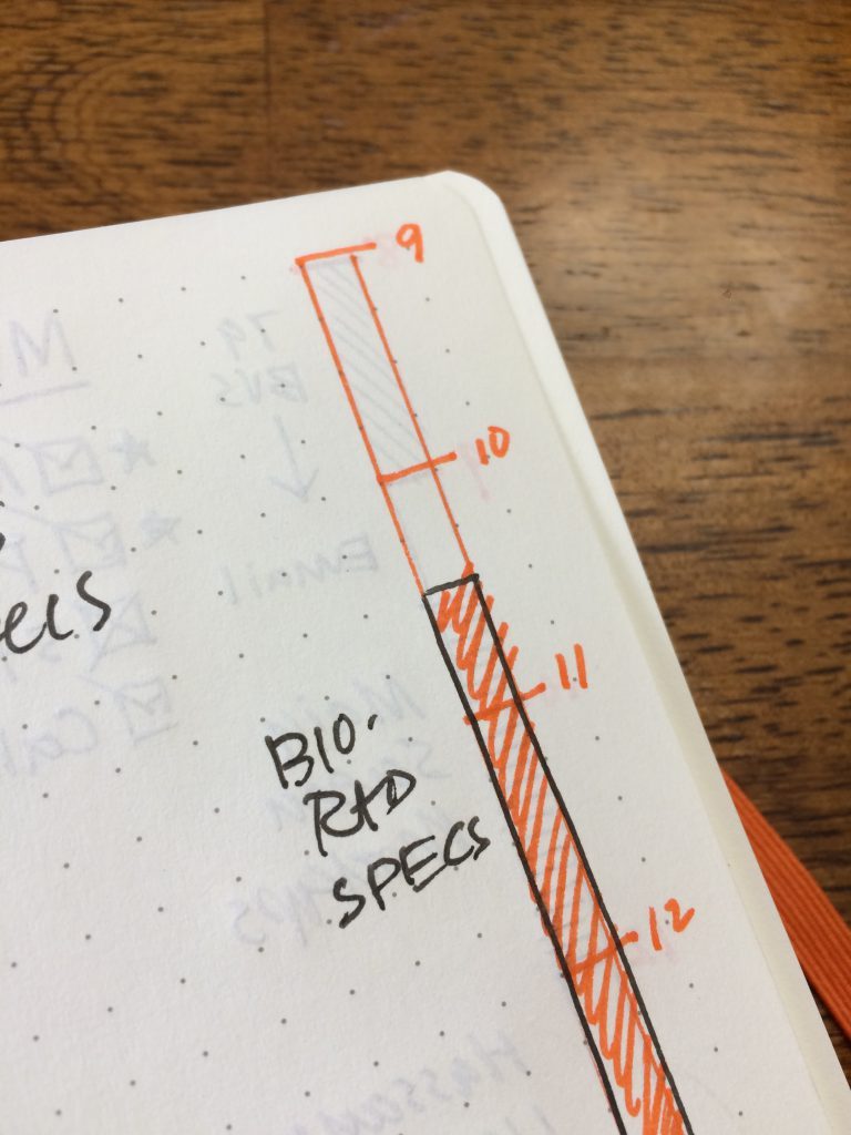
Create the bar on the right side of the page, for right-hand pages.
Step 3: Create hour blocks with the vertical bar by closing off the top of the two vertical lines with a horizontal mark, adding horizontal marks down the vertical bar every 4th grid measure, like this:

Count off 4 grid, then create a horizontal line, to represent an hour of time.

Step 4: Add hours on the left edge of the vertical bars. In addition to identifying one hour increments, the dot grid rows allow you to break each hour chunk into 15 minute increments. The margin to the left (or right) of the Plan Bar provides space for the hour indicators.
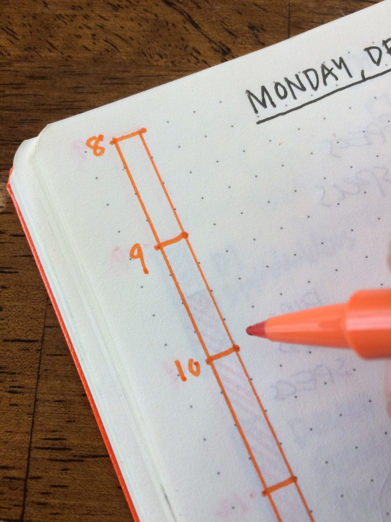
Step 5: Map out your day, using different hatch patterns and/or colors to identify the blocks of time. Here’s a block of time marked with an angled hatch and label.
Blocking out time for design or other creative work, instead of leaving these as open space, encourages me to protect and fight for my focused work time.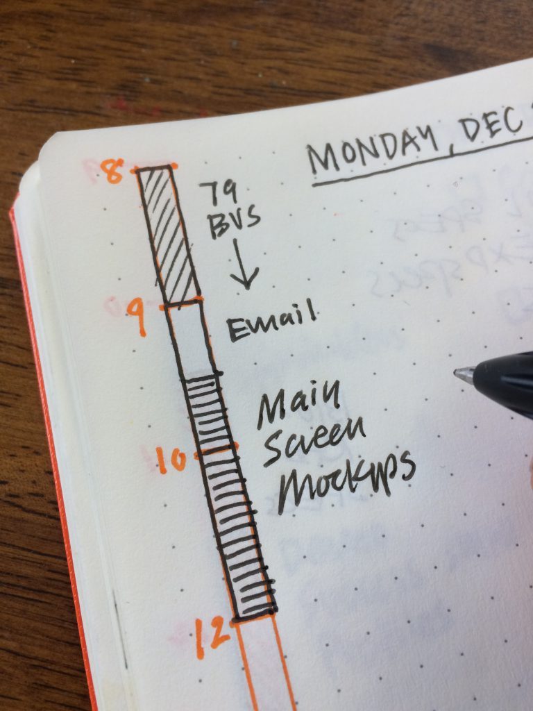
You can just use the squares needed to represent time. Email is a 30 minute time block.
For meetings I’ll include people’s names, locations, room numbers, phone numbers — whatever helps me define the time block.

As the day unfolds, I’m not afraid to reshuffle — and if that can’t be done within the bar, I add a new section to the right or left of the bar with the updated changes. Doing this helps me see changes more clearly.

Adding a 30 minute impromptu co-piloting design meeting to my plan.
If a meeting gets cancelled, I simply X it out and leave a note.This is how I cancel and annotate a cancelled meeting.

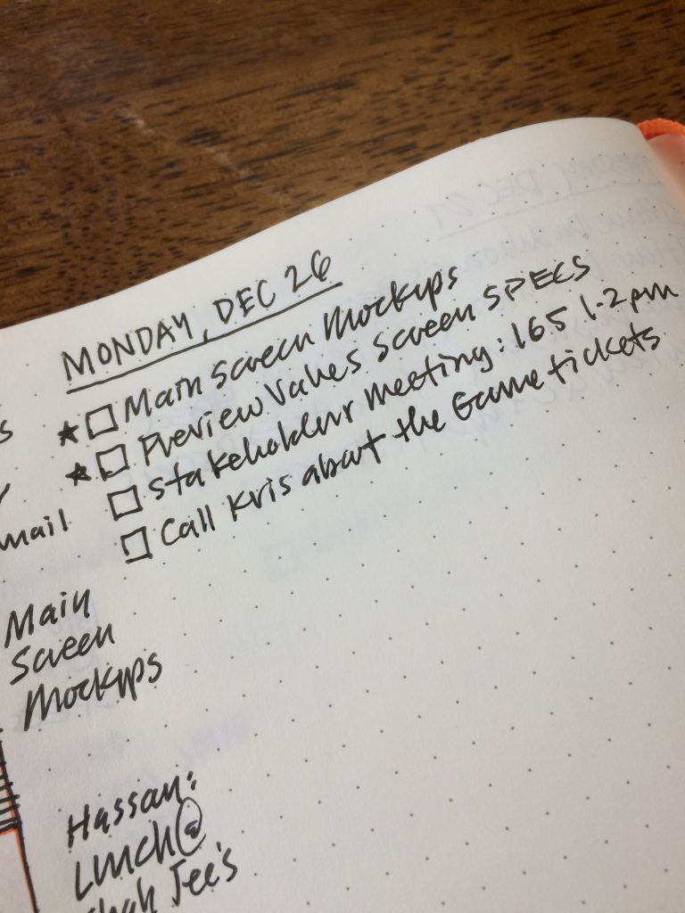
Step 6: Below the date on the top left or right, I use traditional task list, placing the most important tasks at the top with stars next to them.
If a more important task is added later on in the day, I’ll use a star to the left of that task for emphasis. Stars help me see the most important tasks for the day.
Step 7: The remainder of the page is free for notes, drawings, sketchnotes, or whatever I might need to think through during the day. Often I will log decisions I make as they happen, so I can scan back in my book later on. A completed page, featuring the Daily Plan Bar, tasks, notes and an explanatory sketchnote of a Moka Pot.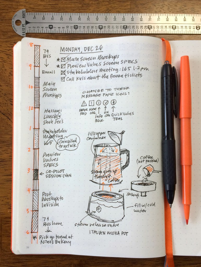
The beauty of the system is that it’s simple, and I like the morning ritual of laying my day out. I appreciate how this analog approach frees me from constantly looking at my calendar on my Mac, or on my phone.
I place my notebook on my desk, so it’s easy to scan. Using an analog tool like the Daily Plan Bar and a simple task list helps me focus on my planned activities and tasks, while my email and calendar apps stay off.
Additionally, I have a daily record I can scan back through to see where tasks were started and completed, where changes were made, or to find ideas or thoughts about a project.
I’ve been using this system since March 2016, and have found it a worthwhile practice. I hope it inspires and helps you too.
